
See how we designed the Fixsy Website to turn fragmented service requests into a seamless experience, empowering users to choose their service easily.
Designing Fixsy Website: Empowering Homeowners to Manage and Track Services
The main task of our project:
Fixsy is a modern home service platform that connects homeowners with verified local providers for a wide range of services, including plumbing, cleaning, and electrical repairs. The platform enables users to compare providers, create detailed service requests, and manage every stage of their project with ease and confidence.
Designed for convenience and trust, Fixsy offers transparent pricing, AI-powered questionnaires to estimate service time and cost, user reviews to support informed decision-making, and secure payment options. For urgent needs, the platform also provides immediate help with select services, ensuring fast, reliable support when it’s needed most.
Team
My Role
Time Line
Business Goals
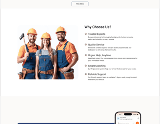
To enhance user engagement, Fixsy focuses on key strategic features that improve clarity, speed, and trust throughout the seamless service journey.
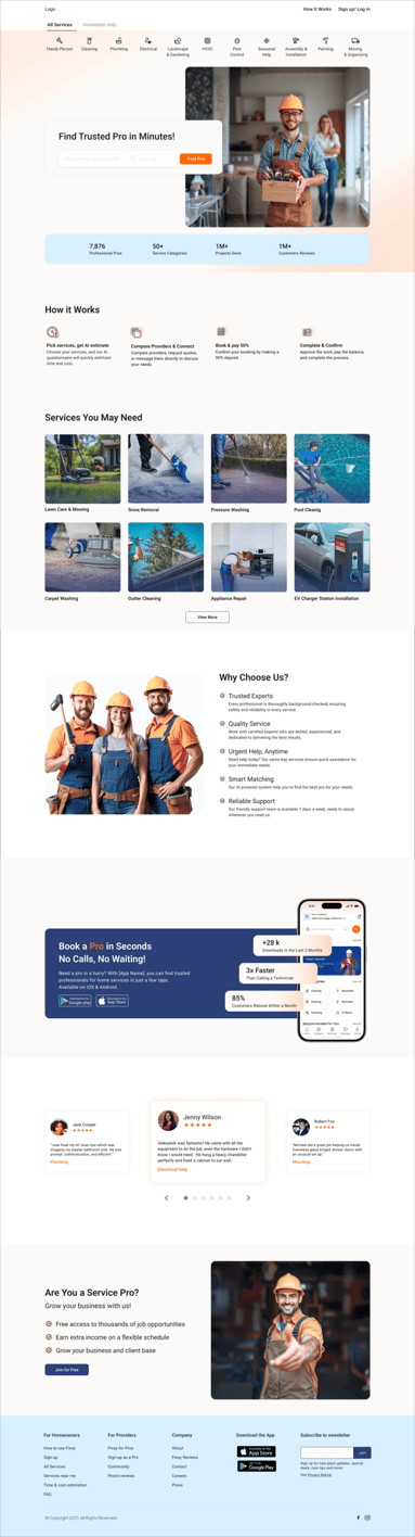
Prominently showcase immediate services on the website.
Use AI to estimate project time and costs.
Design user-friendly provider cards to quickly and clearly present all essential information at a glance for users.
To highlight the provider comparison section, facilitating easier decision-making for users.
Group of 4
UX/UI designer
User research
Information Architectural competitive Analysis
Key flows design
Usability Testing
Interaction Design
Prototyping
Nov 2024- May 2025
Solution
Project Overview
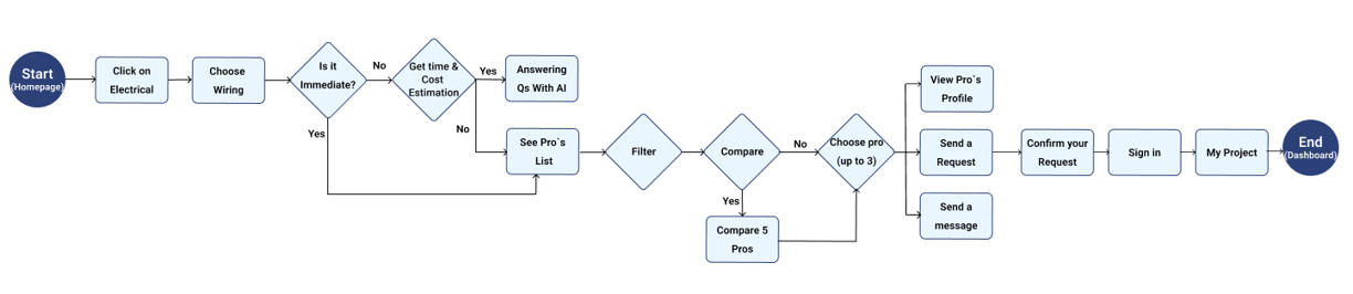
Focus on finding and sending request for electrical wiring
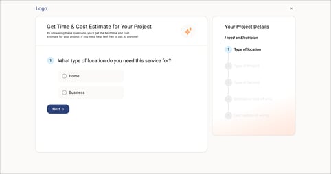
The user needs to rewire a large house last updated 10–25 years ago. The project is not urgent, so they want to explore options using the AI-powered time and cost estimator, then compare electricians before choosing who to contact and submit a request.
To create a smooth and efficient user journey, we focused on designing clear, accessible flows that prioritize speed and usability.
To enhance access to immediate services, we incorporated the design of a tab in the service categories, a dedicated section on the homepage, and a pop-up, effectively highlighting this quick service to users.
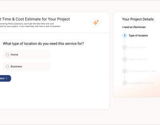
Our AI-driven questionnaire guides customers step-by-step, helping them create clear, detailed requests that providers can easily understand.
Utilizing extensive research, we crafted the information architecture for the provider cards and strategically organized their layout to ensure an optimal design. This approach prioritized essential information, facilitating quick and seamless access for users.
Our simple design enables users to compare up to five providers easily, select their top three, and send requests effortlessly. This saves users time and effort, personalizes their requests, and empowers better decision-making.
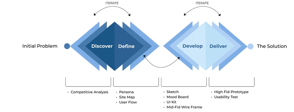
Design Process
My approach follows a structured yet flexible path—exploring, defining, developing, and delivering while maintaining an iterative mindset.
Discover
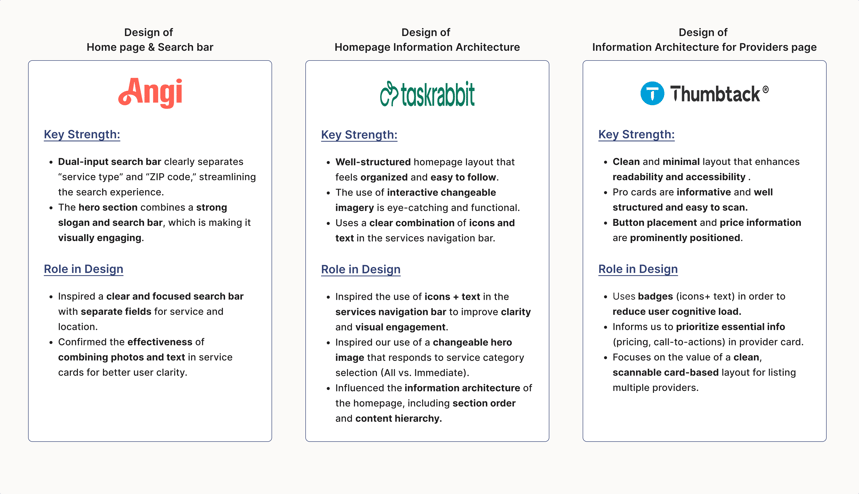
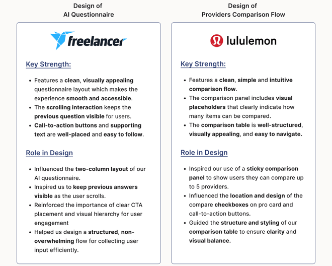
Competitive Analysis
Key Takeaways from direct business models
Key Takeaways from indirect business models
Define
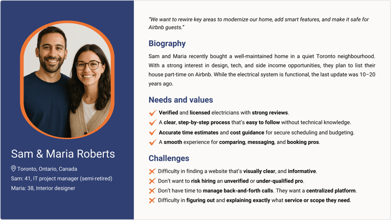
Persona
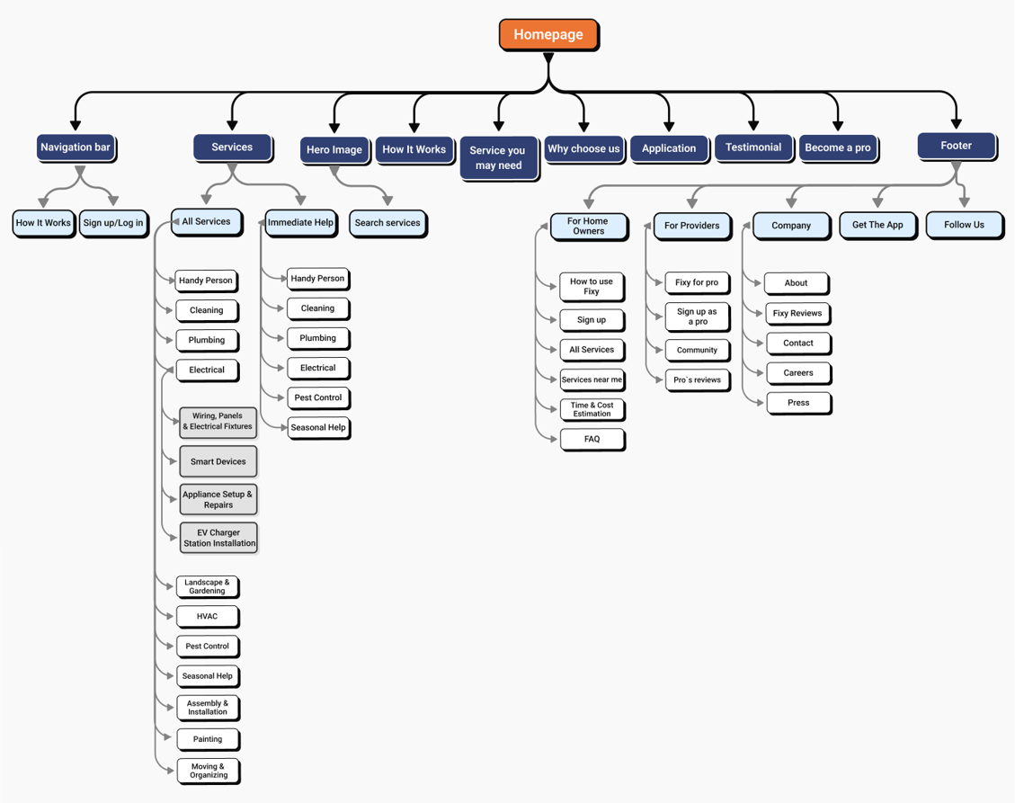
Site Map
User Flow
Develop
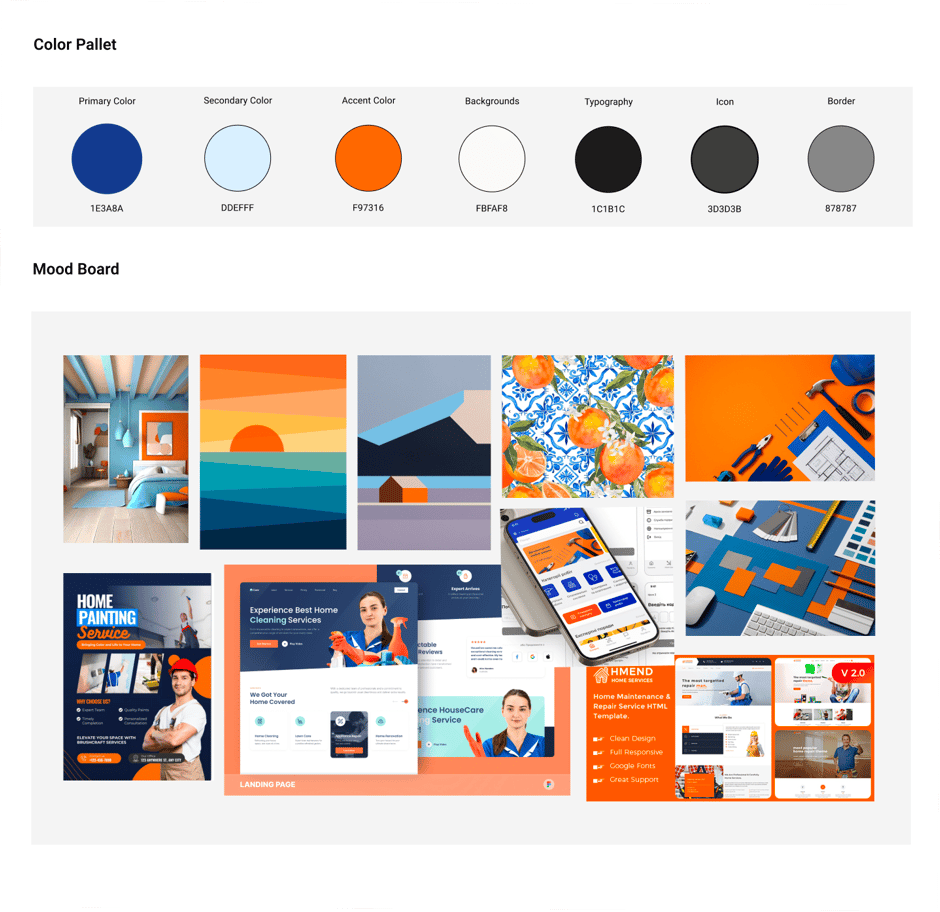
Mood Board
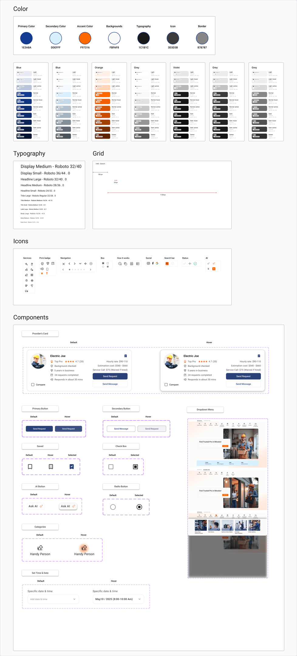
UI Kit
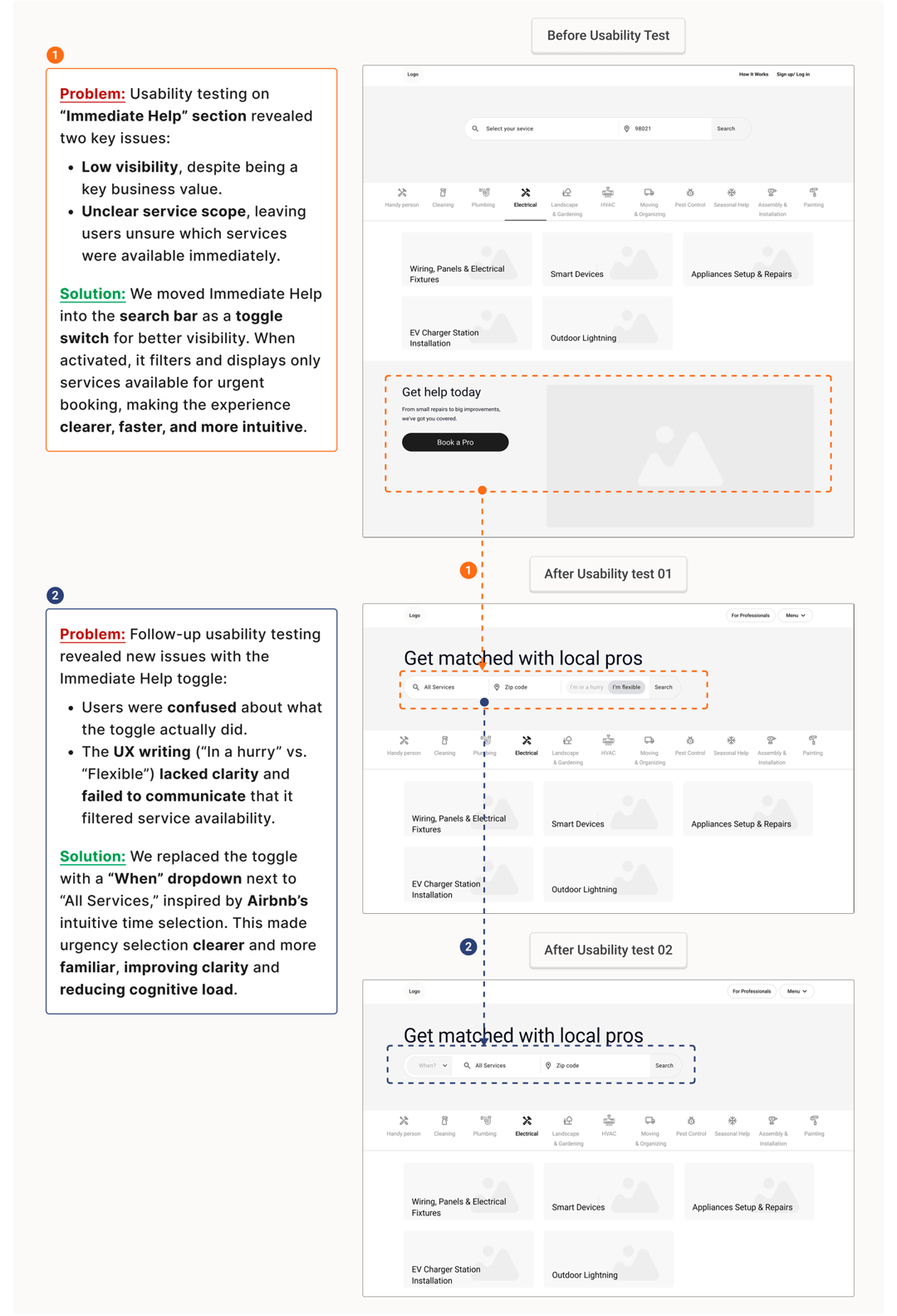
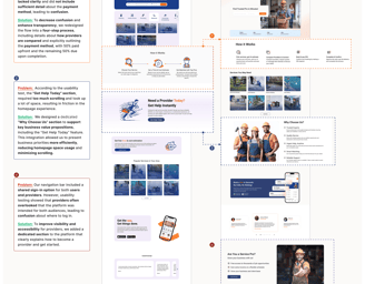
Usability Test (Phase 1)
"Home page"
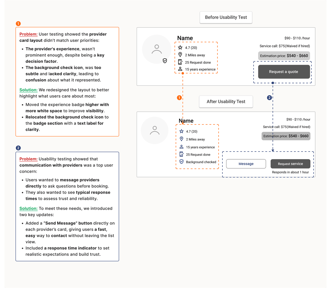
"Provider`s Card"
Mid-Fid Wire Frames
Develop
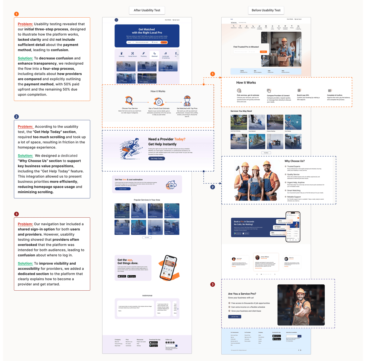
Usability Test (Phase 2)
High Fidelity Wireframes


Got a partnership idea, or a project you need help with? Shoot me a line and let's talk.