Luminous Jewelry
Online Jewelry Website
Project Overview
Timeline
12 weeks
Team
Group of 3
Role
UX|UI Designer

Tools
Figma , Figjam, Google Form, Google meet .
Design a user-friendly website that prioritizes ease of use, attractive design, and effective sales techniques can significantly boost online sales.
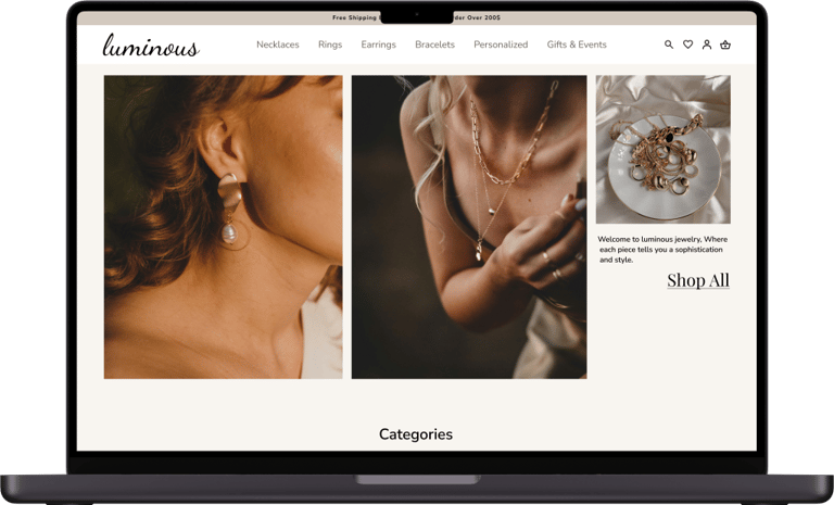
Luminous is a responsive E-commerce web site where customers can easily buy and order custom-made jewelry online.
users can able to identify product with a clean and minimalist design.
Designing an attractive website for users looking for personalised and custom-made high-quality solid jewelry at a reasonable price involves focusing on aesthetic, functionality, and a seamless shopping experience.
Design Thinking
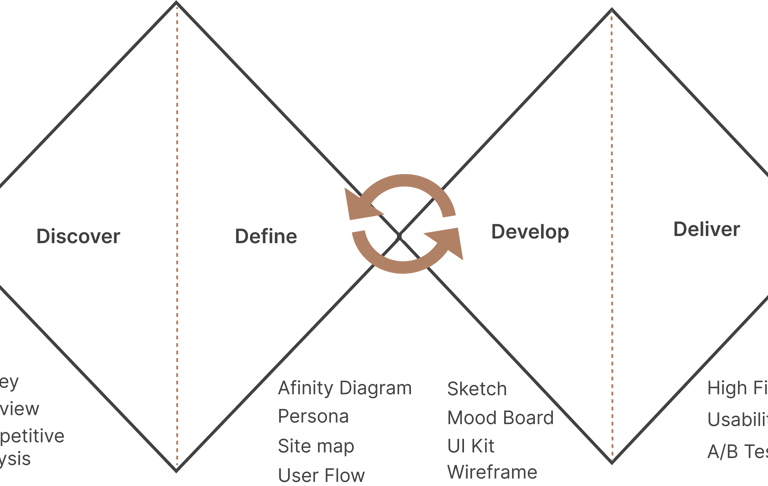
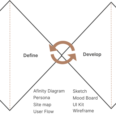
Our team of 3 followed a double diamond approach based on the design thinking methodology. It was not a linear path , we bounced between stages as the project progressed.
Business Needs
Target Users
Discover
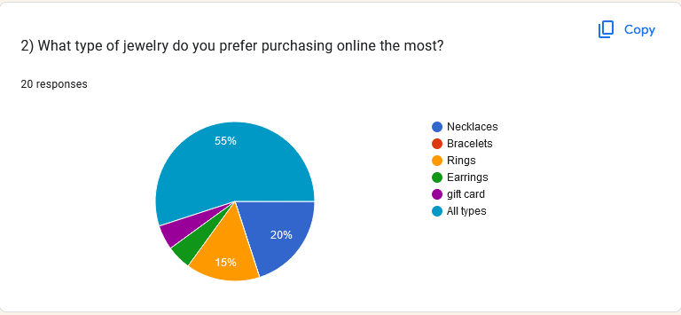
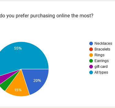
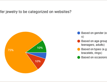
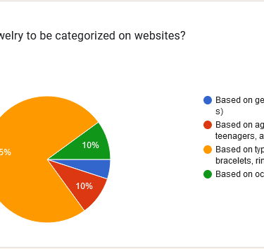
To deepen our understanding of user preferences, we conducted a brief survey and collected insights from 20 respondents. Below are some key insights:
Competitive Analysis
In the initial phase, we started by identifying Jewelry websites with similar objectives to gain a clear understanding of essential features of our design.
we conducted a through analysis of these platforms to find out their structure and functionalities, providing valuable insights for our own design.
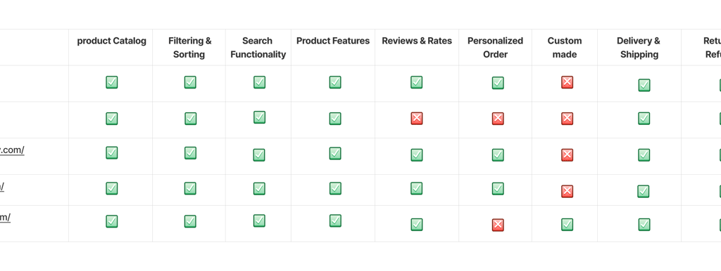
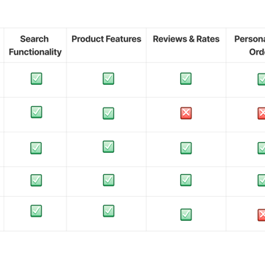
As indicated above, to help users categorize their jewelry for easier access, it's useful to consider different types of jewelry and prioritize them based on factors like frequency of use, occasion, style, and value.
By organizing users jewelry based on these categories, you'll find it easier to access and enjoy your collection while ensuring that your most important pieces are well-cared for.
Survey
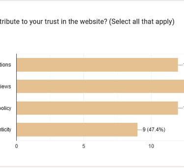
When it comes to building trust with users on a website, positive customer reviews play a crucial role.
By effectively showcasing and managing positive customer reviews, your website can build stronger trust with users, leading to increased customer loyalty and higher conversion rates.
Interview
The interview with 8 people from our survey participants, provided valuable insights emphasizing the importance of meeting users' expectations and build trust by providing easy access to product details, we should focus on the following aspects on our jewelry website:
Detailed product descriptions
Clear jewelry type categories
Robust filtering options
High quality images and videos
Comprehensive product information
User reviews and testimonials
Personalized recommendations
Enhanced shopping experience
Afinity Diagram
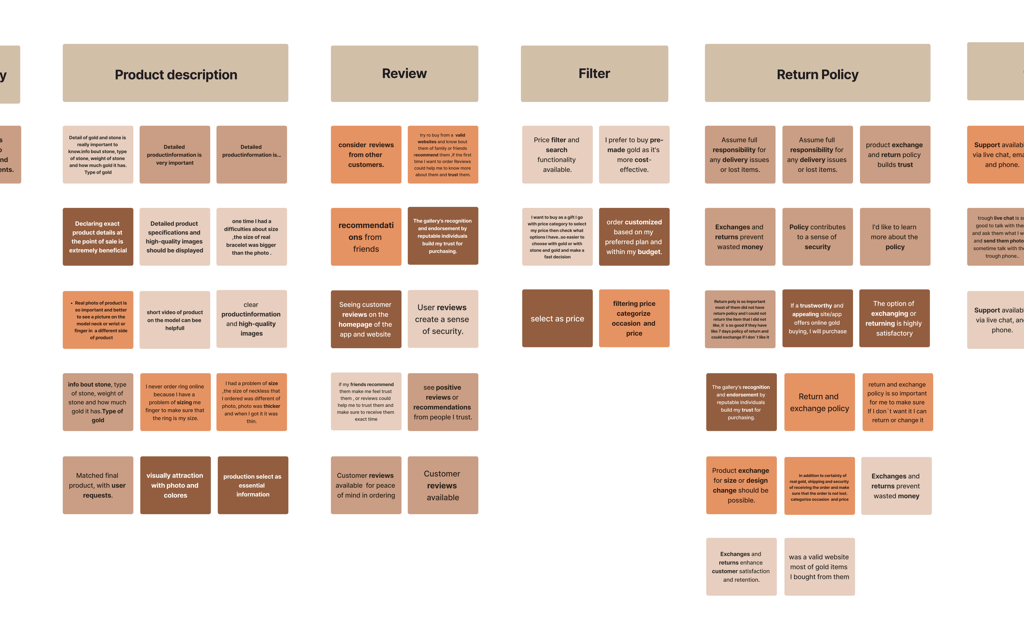
With creating the affinity diagram, we identified the most important factors to consider.
Category of jewelry
Product description
Review
Filter
Return Policy
Customer service
Key Takeaways
When users prioritize an easy path to find their desired jewelry, it's crucial to design an intuitive and user-friendly experience. Here are key strategies to achieve this:
1. Clear Navigation:
Categorization: Organize jewelry into clear, distinct categories such as type (rings, necklaces, bracelets), Color(Yellow gold,white Gold ), occasion (wedding, casual)
Filters and Sorting: Allow users to filter by price, popularity, newest arrivals, and customer ratings. Sorting options should be readily available and easy to adjust.
2.Visual Appeal and Details:
High-Quality Images: Provide high-resolution images with zoom-in features, multiple angles, and videos to give users a comprehensive view of the jewelry.
Detailed Descriptions: Include detailed product descriptions, including material, size, weight, and care instructions, to help users make informed decisions.
3. Customer Reviews and Ratings:
User Reviews: Highlight customer reviews and ratings to build trust and help users gauge the quality and satisfaction level of the jewelry.
Q&A Section: Offer a section where customers can ask questions and get answers, providing additional clarity.
4.Easy Checkout Process:
Streamlined Checkout: Make the checkout process quick and simple, with minimal steps and options for guest checkout.
Multiple Payment Options: Offer various payment methods and clearly display security assurances.
Define
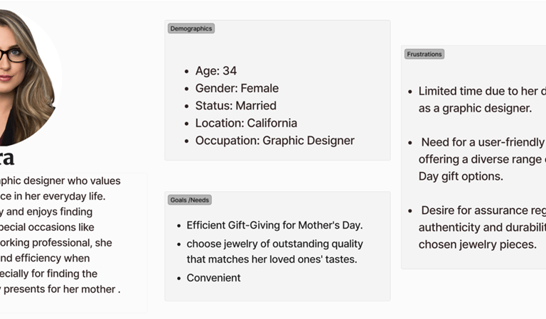
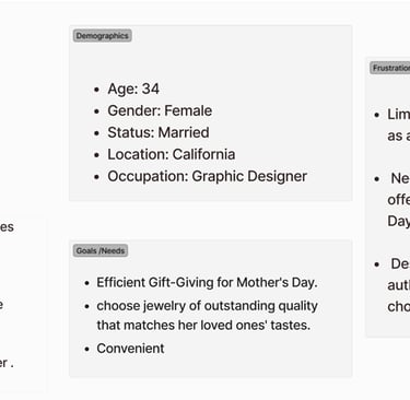
Persona
The insights I gained from surveys and interviews leading up to the persona. The main goal is to display those patterns and pain points, which allowed me to further empathize with users.
Site Map
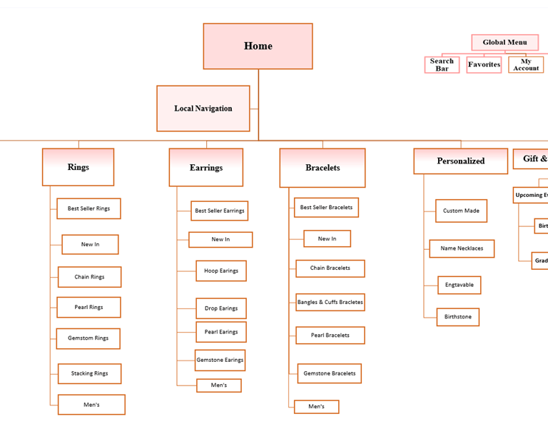
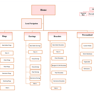
To ensure our information architecture meets user expectations, we conducted open card sorting sessions using the Uxtweak Website. We developed our first version and iteratively refined it based on user testing and competitive analysis.
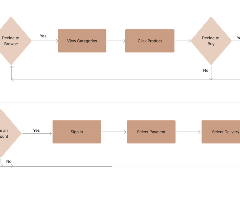
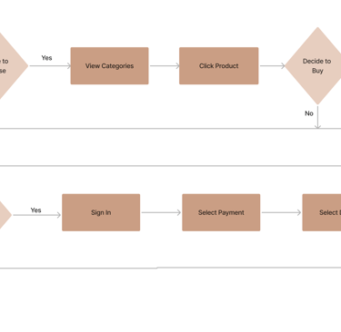
User Flow
Develop
Challenges
Solutions
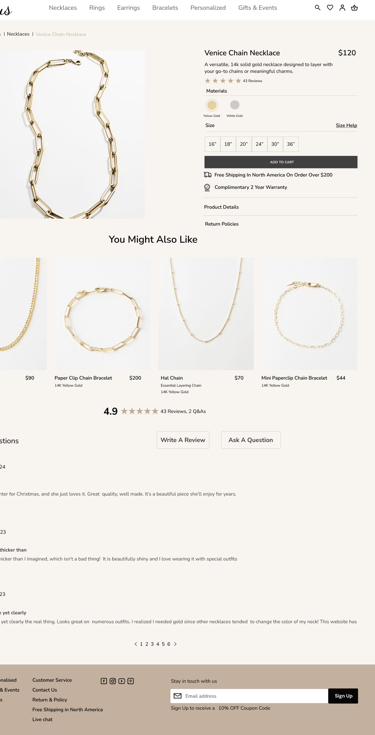
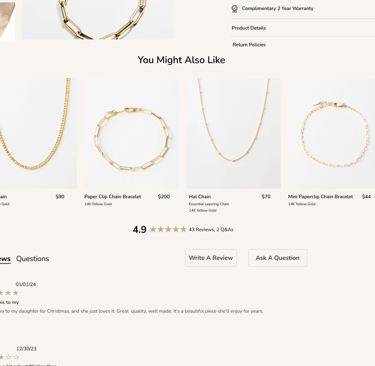
Enhance user trust to buy the high quality of Gold.
1
Building trust with users on a website, positive customer reviews play a crucial.
2
Developing a fast and effective Navigation bar.
It`s so convenient and easy to find their desire type of jewelry from the main part of website which is navigation bar.
Sketches and Wireframes
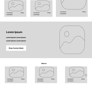
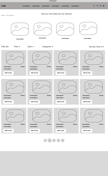
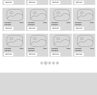
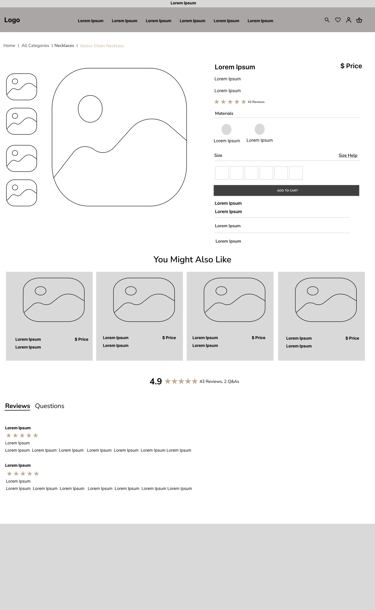
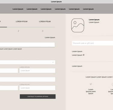
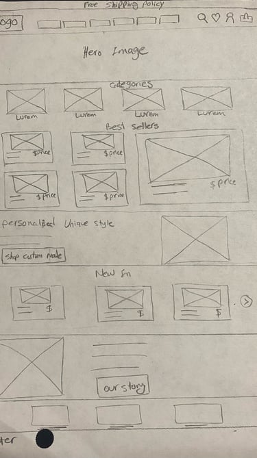
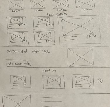
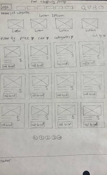
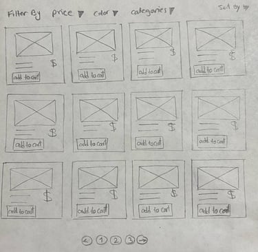
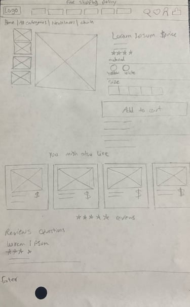
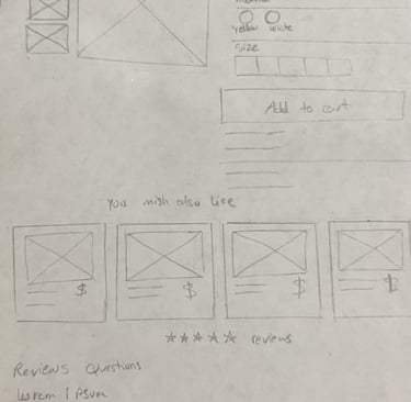
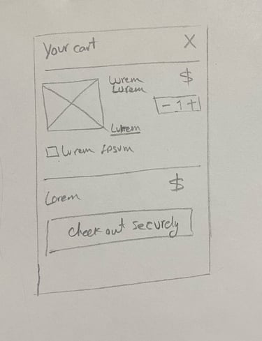
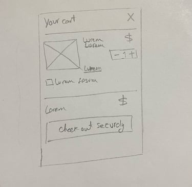
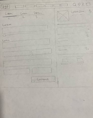
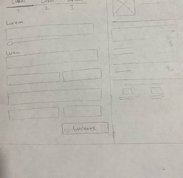
We initially mapped out our ideation using hand-sketched low-fidelity wireframes, aiding communication within the team during the early design stages. Later, we transitioned to creating low-fidelity wireframes on Figma to visualize page layouts and design direction. These wireframes underwent several iterations before final content development.
User Flow
*Primary users would be people who love to Buy solid gold jewelry.
*Secondary users would be people who love to Order unique personalised solid gold jewelry.
*We concentrated on designing the website for people who love to Buy a solid gold jewelry.


The goal of the company is to increase online sales and customer engagement on the e-commerce site. The aim was to connect customers with the home for everyone who loves.
Sketch
Mid-Fid Wireframe
Home Page

Category Page
Product Page
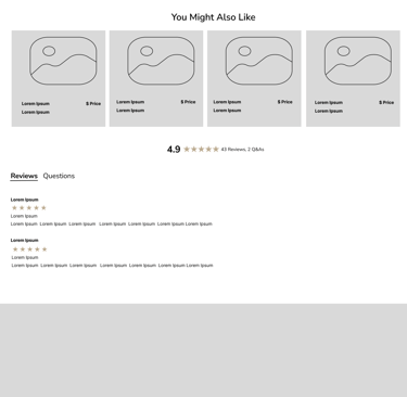
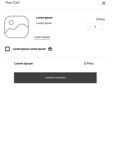
Overlay Basket cart Page
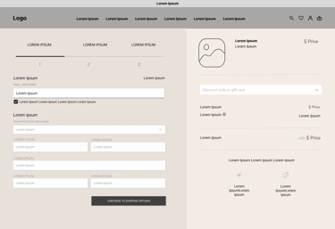
Payment Page
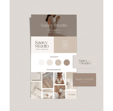
Mood Board
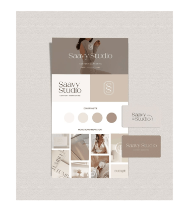
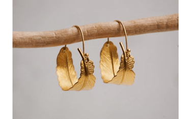
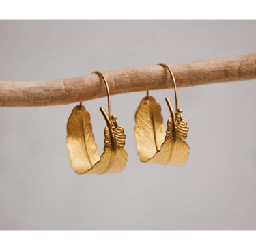
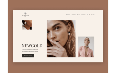
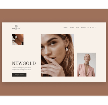
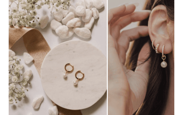
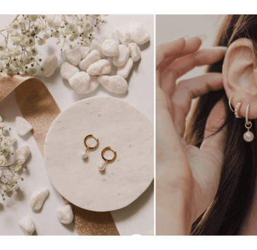
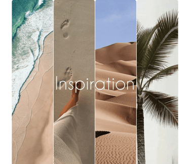
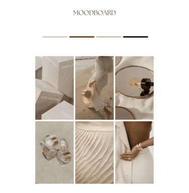
To design a high-fidelity interface for Luminous Jewelry, we start by creating a mood board that reflects the main goals and desired feelings as outlined by stakeholders. This helps us establish the visual direction and overall aesthetic for the interface.


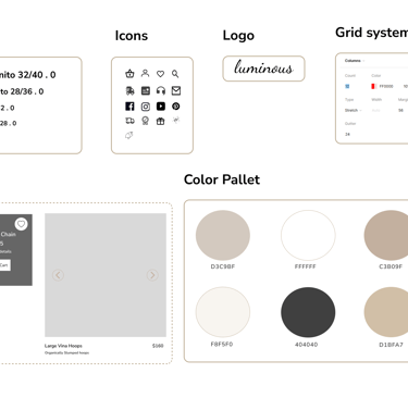
UI Kit
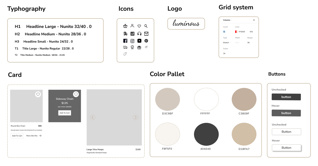
We developed a complete UI kit to serve as a reference for templates and components. This kit ensures that interface development is smooth, consistent, and efficient throughout the project.
Deliver
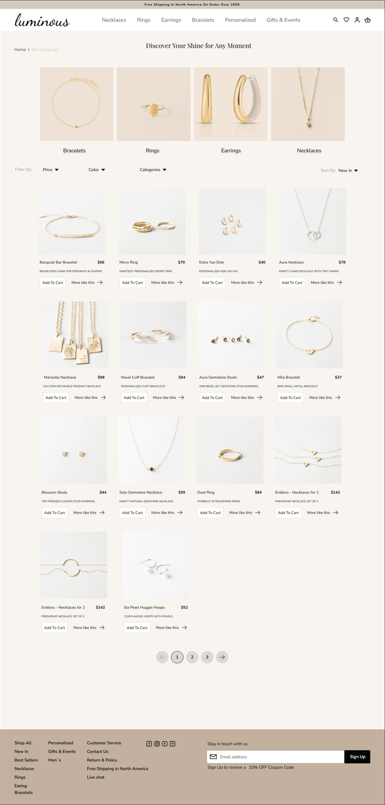
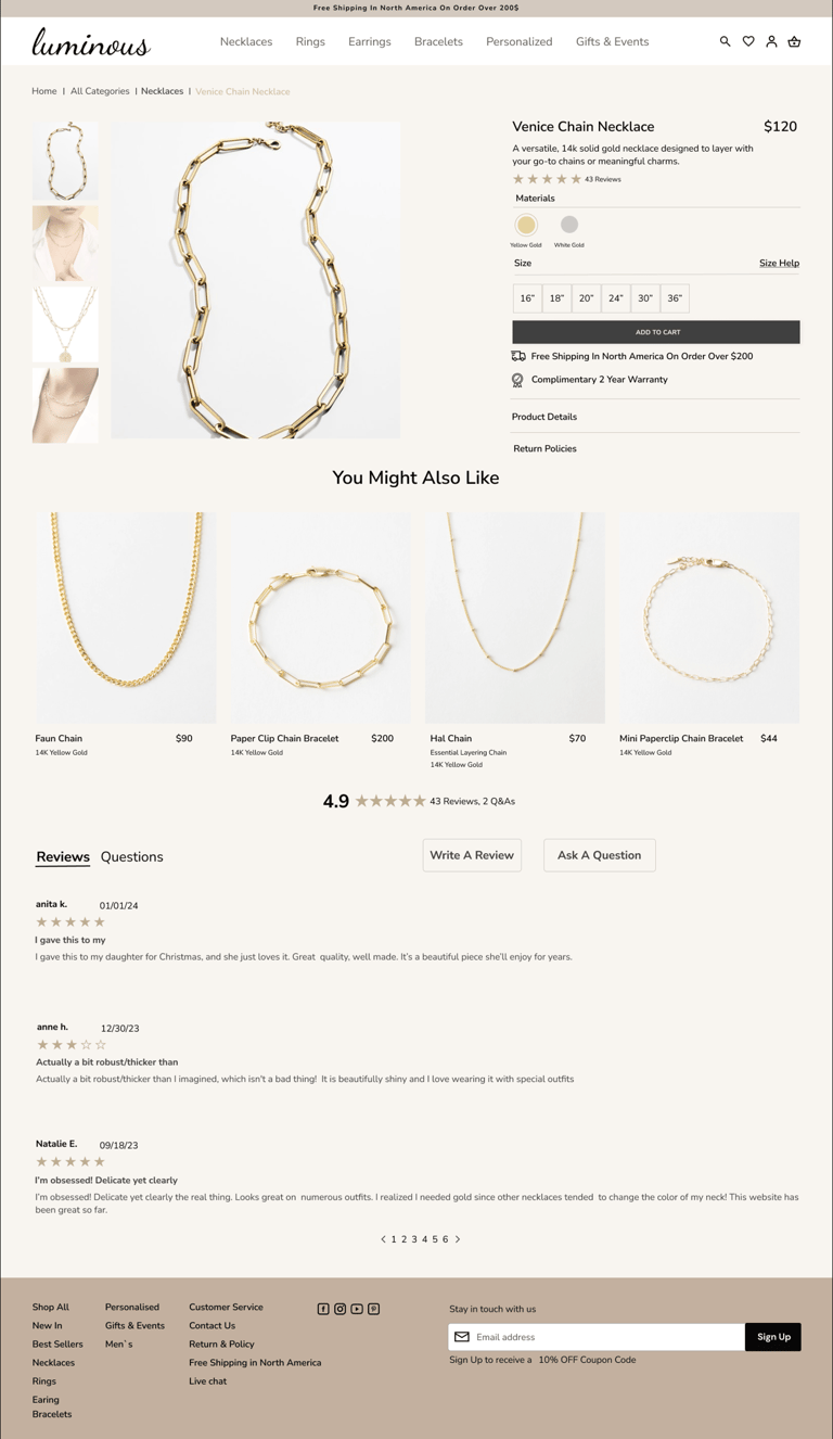
High Fidelity Wireframe


Home Page
Category Page
Product Page
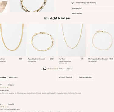
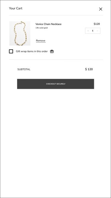
Over lay check out

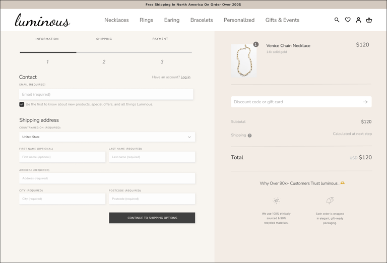
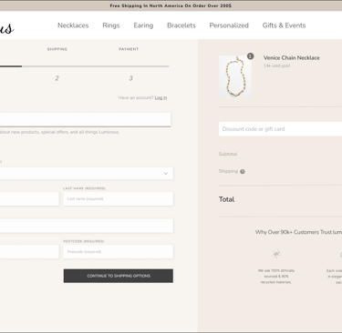
Payment Page
Here is the last prototype, displaying what we've achieved through our design process.

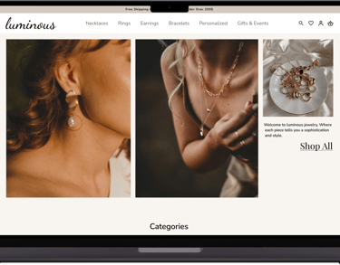
Prototype
Throughout the project, we went through multiple iterations, driven by the insights we gained from usability tests. These tests were instrumental in shaping our decisions and constantly enhancing our project.
Iteration and Usability Test
"Home page"
Before Usability testing
After Usability testing
1
Users found out it takes more time to go into shop in the navigation bar which is open overlay of navigation bar all type of categories.
1
2
So we decided to remove the shop and we have all main type of categories which is easier to help users to find their desire type of jewelry with quick click.
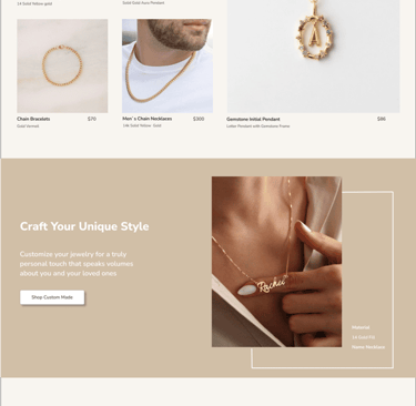
3
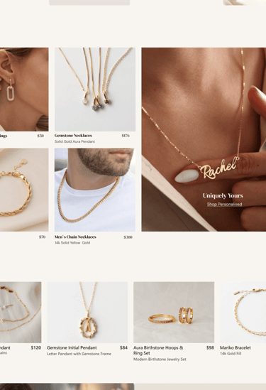
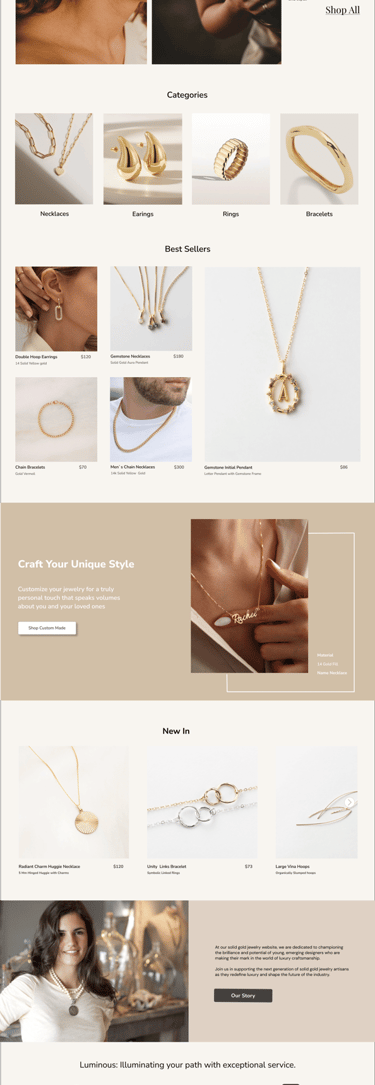
The category section which are those small pictures under hero image don`t effectively show that users can click on them most of users though it was part of hero image and did not have labels .
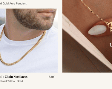
Following usability testing,we acknowledge thatin best seller section the personalised photo should be separate on a new section with a detail of description because our website has an offer that users can order personalised unique gold.
3
4
4
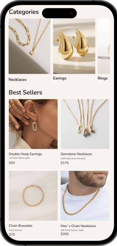
Now we moved all category photos in separate section with labels so user can understand they can click on them.
5
5
5
2
"Category Page"
Before Usability testing
After Usability testing
1
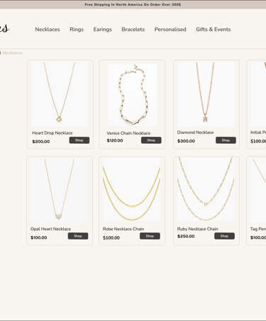
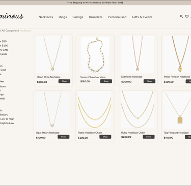
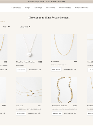
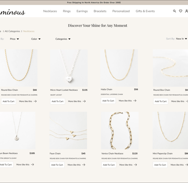
It sounds like the usability testing you conducted revealed that users prefer having filters located at the top of the product listings in the form of a drop down menu. This allows them to easily select their preferred filters and see the results, with the added benefit of displaying larger product images for better visibility.
*This approach likely makes the filtering process more intuitive and user-friendly. Larger images also provide more visual clarity, which can help users make quicker and more confident decisions.
1
1
1

Before Usability testing
After Usability testing
"Payment Page"
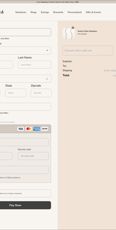
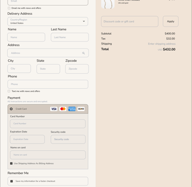
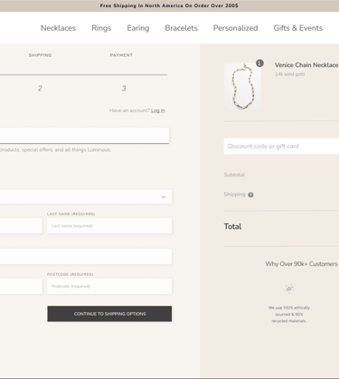
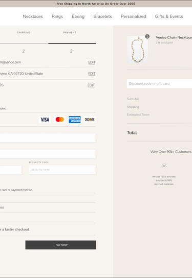
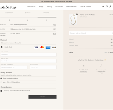
First we designed payment page like model 1 and after test users must scroll down a lot to get down to fill all information and it take more time,they need easier process of payment with less scrolling down.
so in the new version we decided to change the process of payment and instead of one long page with too much scrolling down , designing two short pages that helps users to fill their information with no scrolling and more quick and easier way to finish their payment process .
1
2
2
A/B Testing
2
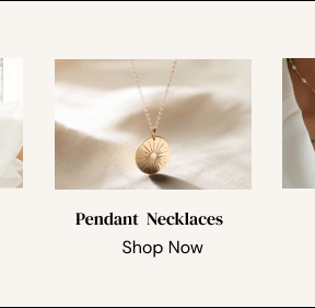
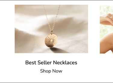
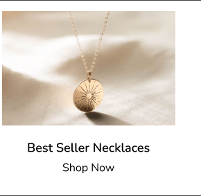
During testing with 15 users ,the majority expressed a preference for frame B. This version of overlay navigation bar with two photos of best sellers and all type of each categories was more useful for users rather than pictures of all types of categories.

A
B
Reflections
What I have Learned?
Effective communication with team members and lead challenging situations and learned how to collaborate within the team ensured timely delivery and meeting deadlines.
The crucial role of research in enhancing product effectiveness.
When designing it`s important to to strike a balance between meeting user`s need and aligning with stakeholders ` marketing strategies.
Testing and iteration improved user-friendliness.
Embracing the iterative learning process can lead to better outcomes because it allows for flexibility, growth, and continuous improvement. By focusing on adaptability rather than being right from the beginning, you're more open to learning from mistakes and making adjustments that can enhance the project's success.
Developing a UI kit ensured consistency and eased communication.
What next?
The next steps involve finalizing the mobile version of the design to ensure adaptability.
Following this, we'll enhance the user experience by conducting additional usability testing and iterations to refine the user flow further.
Consider a solution for when tools become outdated or less utilized over time.
